A while ago, my friend Andrew reached out to me and asked for a logo for his new mobile tire shop, InMotion Mobile Tires. The shop offers full tire service, including tire rotation, mounting, balancing, and flat tire repairs.
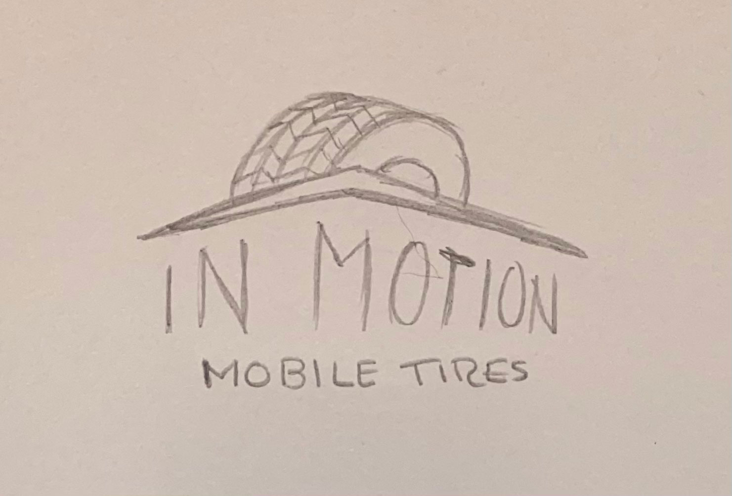
InMotion Concept Design
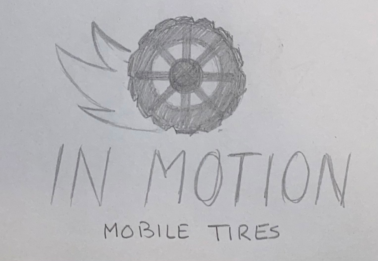
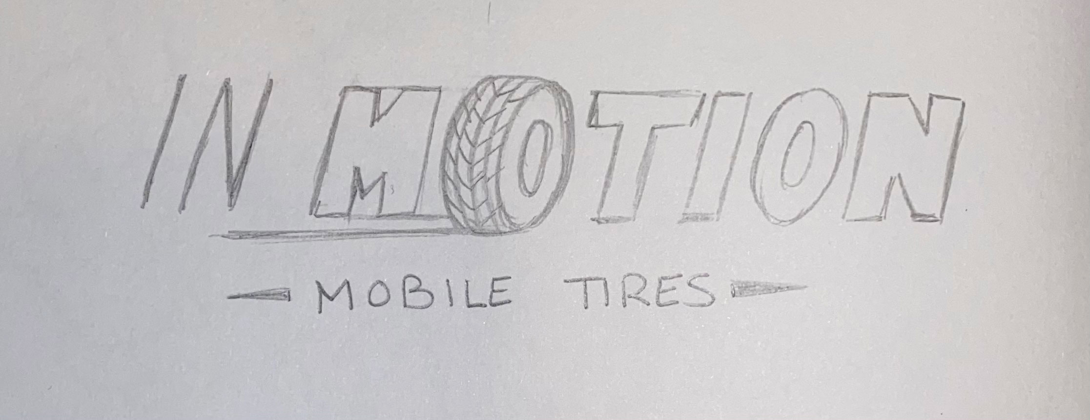
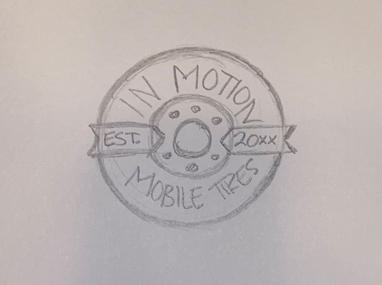
The original idea for the logo was to have a tire rotating in the shape of an oval. I also experimented with a few other ideas, taking a lot of inspiration from vintage tire shop logos.
Eventually, we settled on the second option. Now it was time to start designing the final logo.
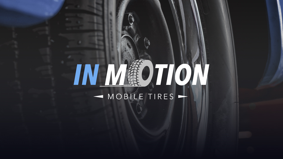
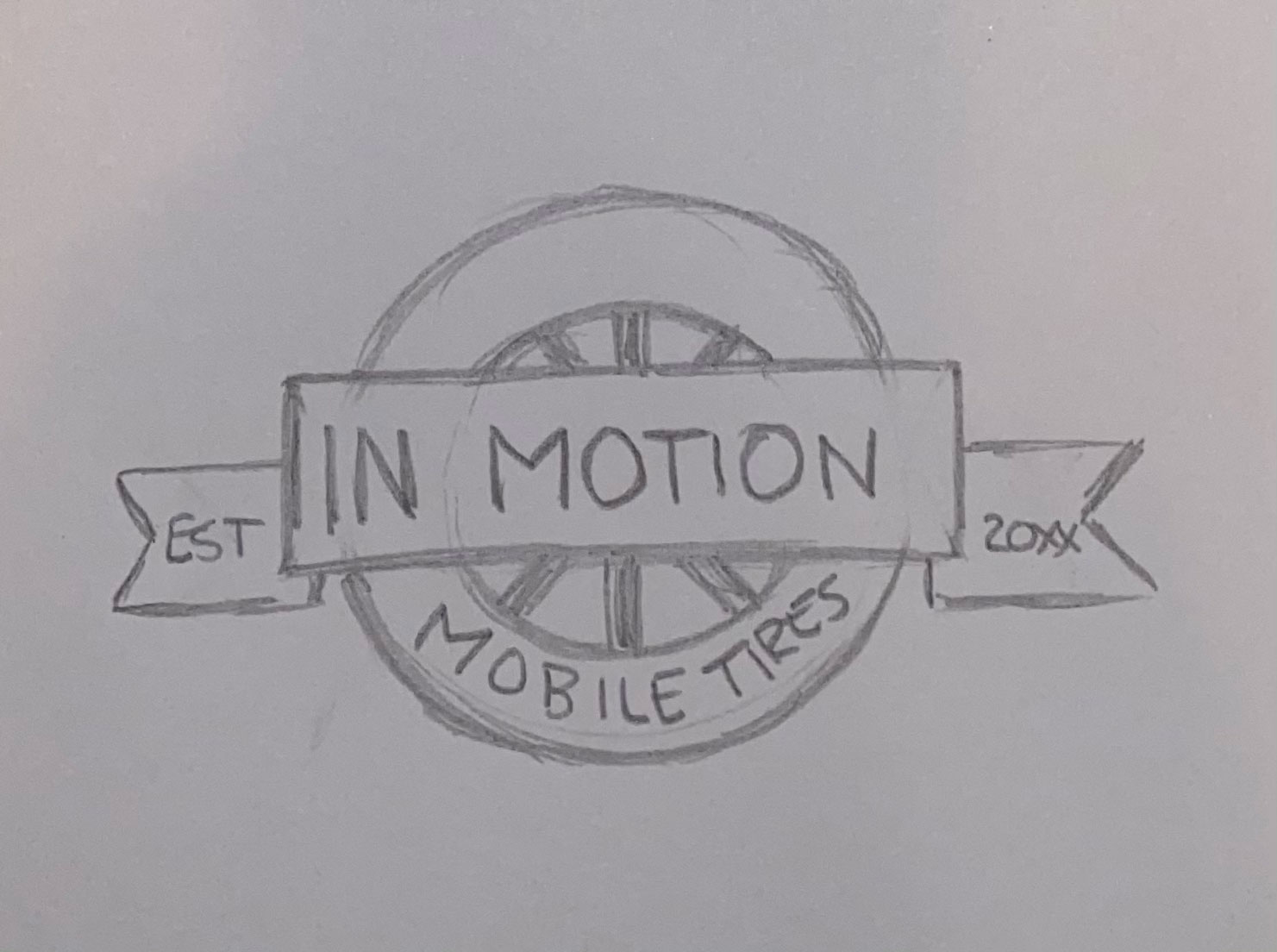
Final InMotion Logo Design
This is the final logo design, which I created using Adobe Illustrator. For colors, we agreed upon using a light blue and shades of gray. I made two versions for light and dark backgrounds.
Overall, I love how this turned out. I can’t wait to see how this will be used officially; on apparel, signage, and other branding assets!
If you’ve ever even thought of giving your brand a fresh new look, feel free to contact me here by clicking the button below. I’d like to get in touch with you to see how I can help create your new brand identity. Also, be sure to follow me on Facebook, Twitter, Instagram, and Linkedin for updates on any new projects. You can also subscribe to me on YouTube.
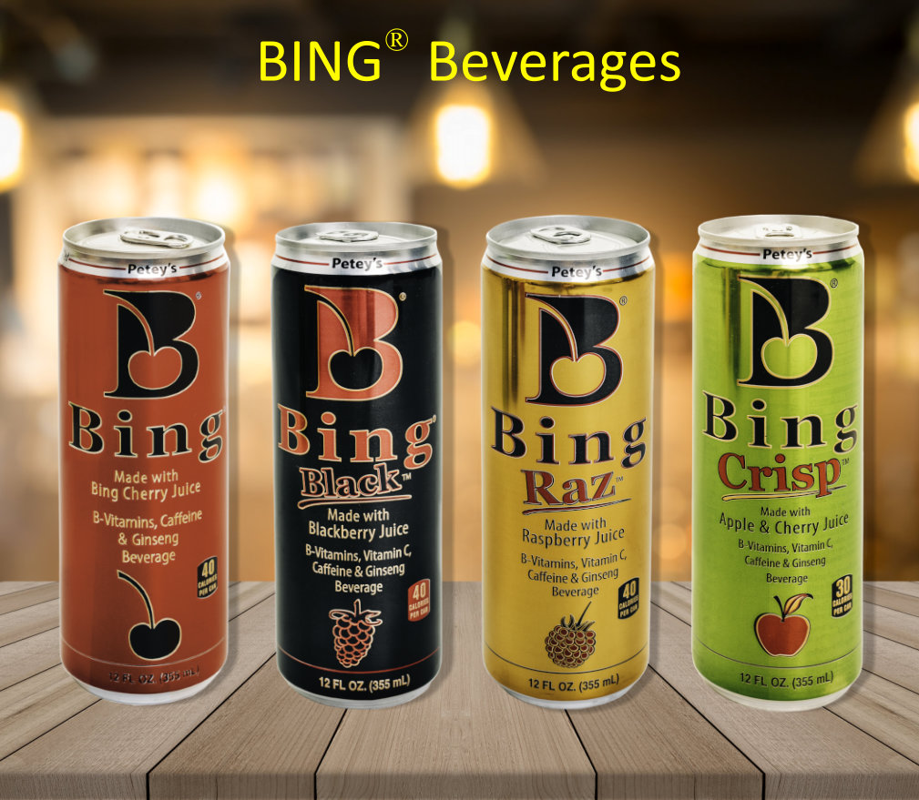
Recently I was tasked to complete a rebrand for Bing Z kombucha. The goal was to create a new logo, as well as a new packaging design, website design, and marketing assets to increase Bing Beverage’s market share.
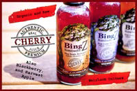
Old Bing Brand
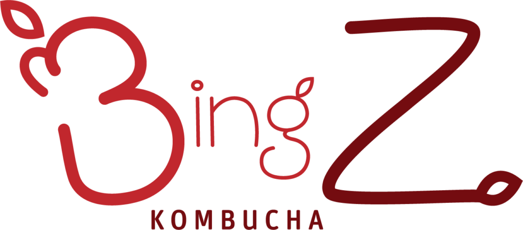
Bing Z is a brand extension of Bing Beverage®. The Bing Z Kombucha logo consists of the brand name in plain serif text. It’s different compared to Bing’s caffeinated beverage packaging, which is the brand name in a thick red serif font. The lower counter of the B is in the shape of a cherry. The kombucha almost feels like a completely different brand entirely. I wanted to design a logo that would communicate a strong message and could be used for both products. One weakness is that they only sell their product in single bottles. I think it would be beneficial if they had the option to sell their product in a six pack carrier as well.
Bing Z SWOT Analysis
A SWOT analysis is a list of your company’s strengths, weaknesses, opportunities and threats. Performing a SWOT analysis is very beneficial to the design process, as you’ll have a better understanding of the brand’s advantages and disadvantages in their product market. After completing my SWOT analysis of Bing Z, I determined that the brand is already well respected in Colorado, being sold in local big box stores and even distributing to other states. Bing Z also offers a fruitier tasting kombucha by mixing real organic fruit juice with their kombucha brew. However, I saw opportunities for a strong package design and an updated web design to seal Bing Z’s reputation as a great tasting kombucha.
Bold Fruity Value
New Value Proposition: Natural organic energy with a bold fruity twist
Bing Z is all about the juice. It’s what makes the drinks taste so good. What’s even better is that it’s all organic, so you still get the health benefits of traditional kombucha. This really stood out to me for the brand, so I felt that it was important to highlight the fruit flavor in a new value proposition.
New Mission Statement: BingZ is juicing up the exciting world of kombucha. We combine the traditional tangy flavor of kombucha tea with our organic, mouthwatering Cherry, Blackberry, and Harvest Apple flavors, all while providing you with those healthy probiotics all in one bottle. Our savory line of booch will definitely have you coming back for more.
Mission statements are meant to answer two questions: What is the goal of the brand, and what steps are being taken to achieve those goals. Bing Z is trying to get people to drink their kombucha. Their doing that by combining their fruit flavors with kombucha to offer a great-tasting drink that’s also good for your body.
The New Bing Z Logo
After tossing around a few different ideas, this is how the final Bing Z logo came out. I think it’s successful because it communicates the new value proposition perfectly. This is a kombucha brand that isn’t afraid to show off those bold fruit flavors to its audience. The new logo stands out compared to the other kombucha brands because of how different it is. Most kombucha brands go for a more corporate look with a sans serif typeface, but Bing Z affords a more fun approach. It’s more eyecatching, and definitely and improvement on the old logo. Bing Z Kombucha is now the kombucha that has a stand out logo to compliment the stand out flavor.
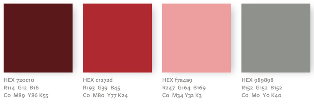
Brand Colors
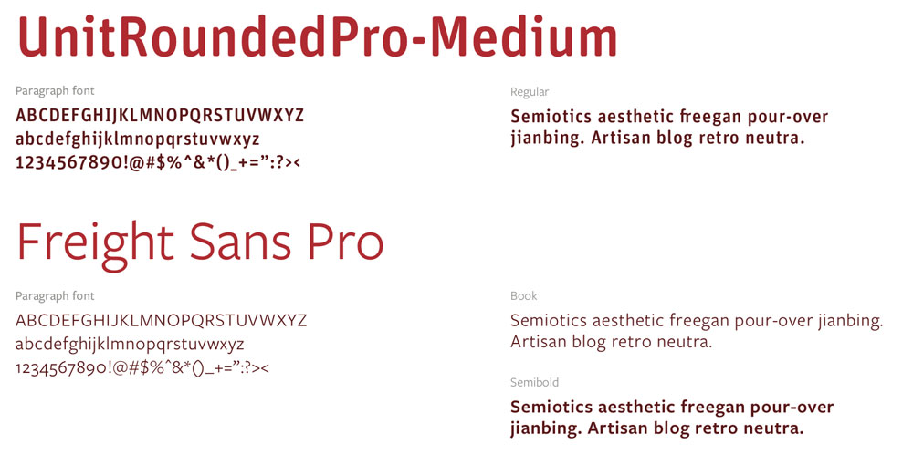
Brand Fonts
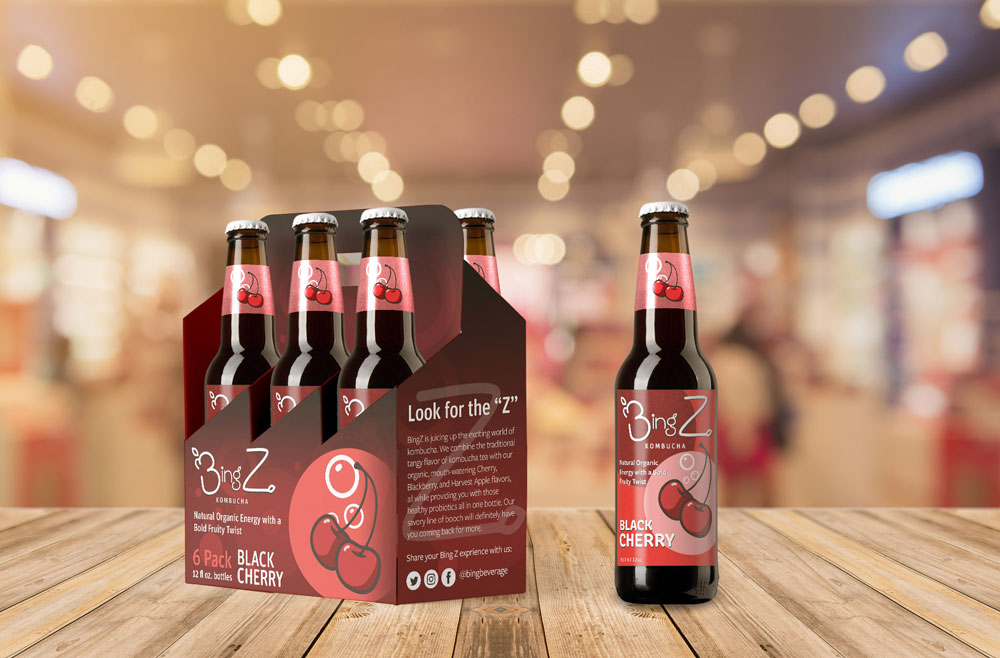
Bing Z Packaging
I created some different packaging materials, including a six pack carrier design, and new bottle labels. The new packaging for Bing Z Kombucha communicates the new value proposition of the brand: Natural organic energy with a bold fruity twist. The label does more for the brand than decoration, it provides information that will entice buyers make a decision at point of purchase. Ultimately, good packaging should get the customer to understand the company’s value and the positive experience they will get out of interacting with the product; in this case, enjoying a refreshing healthy beverage.
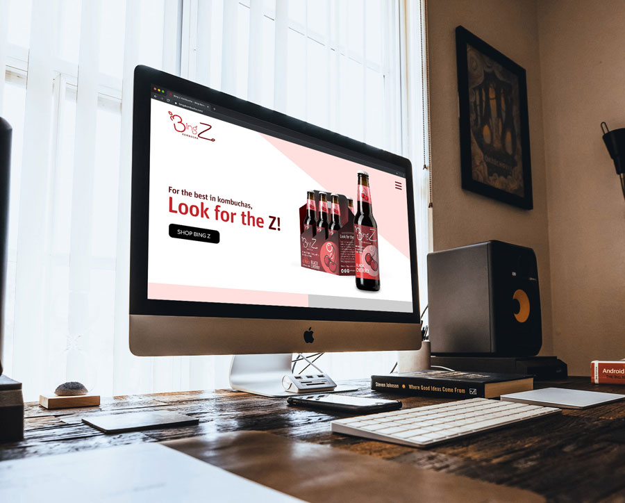
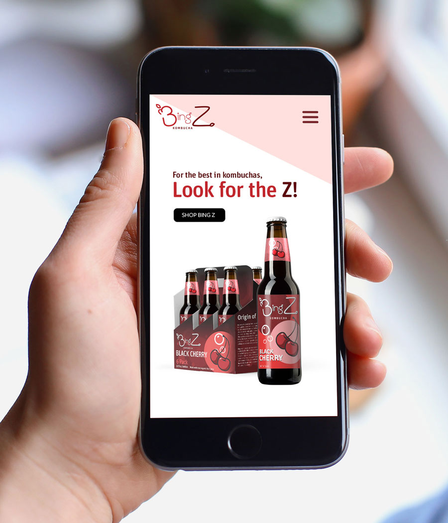
Bing Z Website, Desktop and Mobile
After creating the logo and packaging, I created mockups for a new mobile website for the brand. 52.2 percent of all website traffic worldwide was generated through mobile phones, up from 50.3 percent in the previous year. This is huge considering the iPhone was introduced in 2007. Making sure that your brand website is mobile responsive is crucial considering how many people are viewing your site through their phone.
If you’ve ever even thought of giving your brand a fresh new look, feel free to contact me here by clicking the button below. I’d like to get in touch with you to see how I can help create your new brand identity. Also, be sure to follow me on Facebook, Twitter, Instagram, and Linkedin for updates on any new projects. You can also subscribe to me on YouTube.
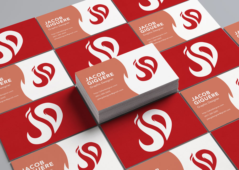
As graphic designers, we know that we can always improve on our work. Our self identities are always evolving with our style. When we learn new skills, we want to present them in ways that our audience will enjoy. Recently, having learned animation, I wanted to rebrand my self identity using the new skills that I have learned.
I have a separate case study on the animation of the logo. Check it out here.
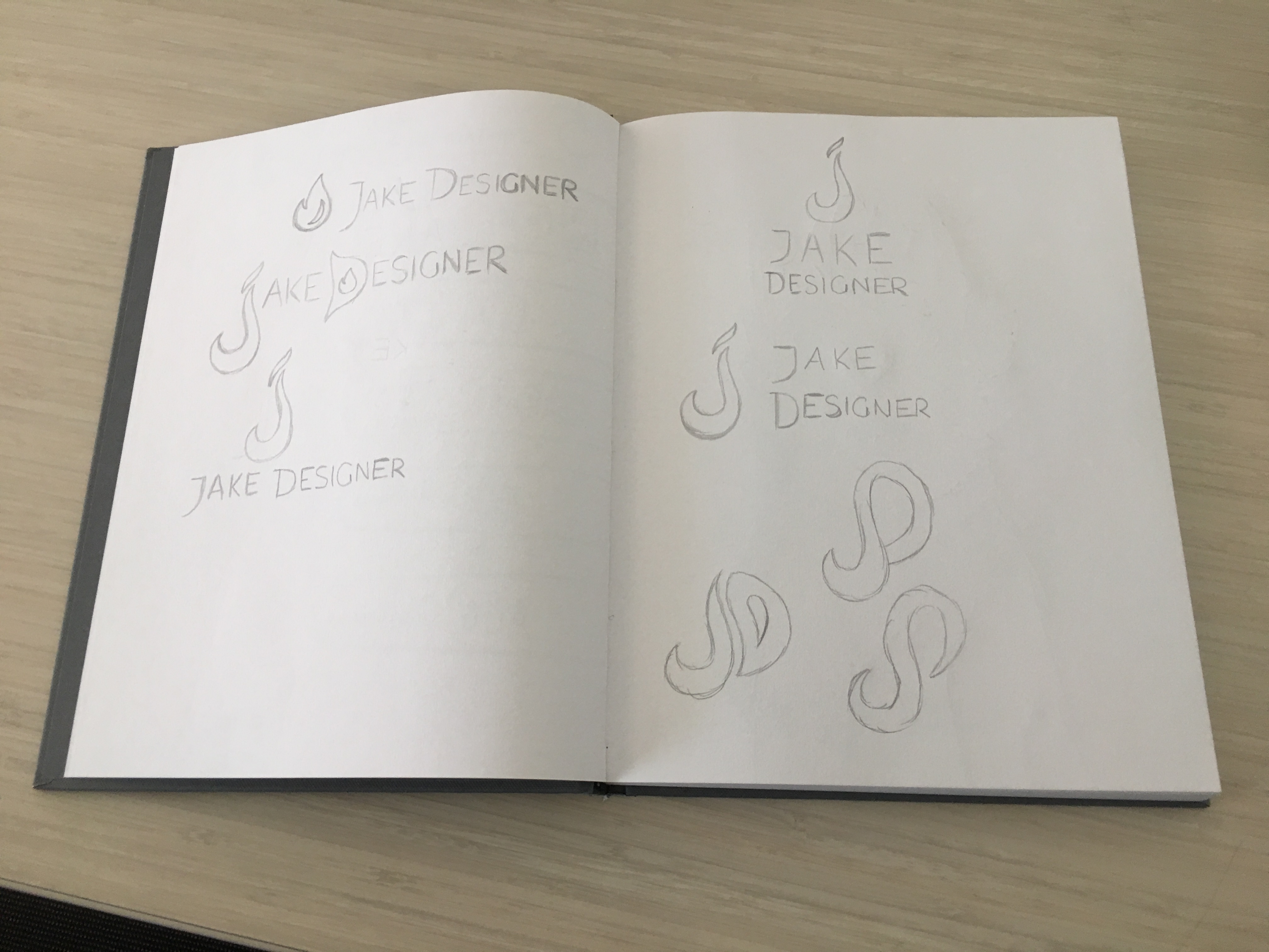
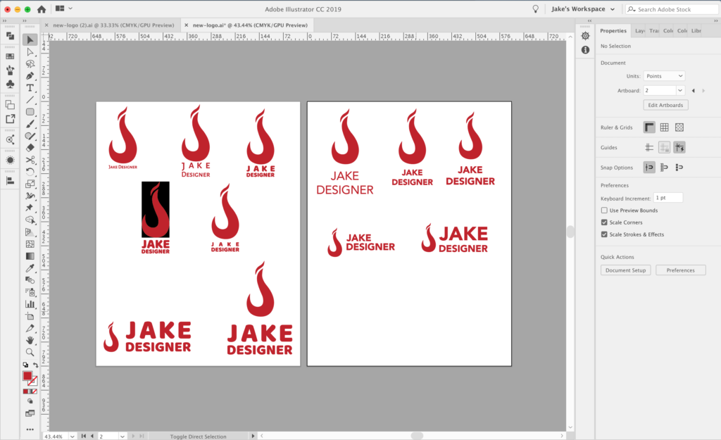
Sketches
As always, I start by sketching a few ideas down. The main thing I wanted to include in this rebrand is the incorporation of a flame. Flames and fire have a huge significance for me. They remind me of when I used to be in Boy Scouts, sitting by the campfire and reminiscing on the adventures that my troop went on and what adventures we will go on next.
I still wanted to keep the letters J and D for “Jake Designer,” so I tried to create flame shapes out of the letters. It was challenging to make them look slick and modern, but I managed to settle on the shapes that you see in the finished design.
Illustrator Process
Time to start illustrating! I traced out the shapes of the letters with the pen tool and added a nice shade of red (#c02026) to the design. Choosing a font was a little challenging. I wanted a sans serif font that was versatile, but I was debating between thin or bold. I eventually settled on Avenir Next Bold. It’s a slick and clean font that works for almost all styles.
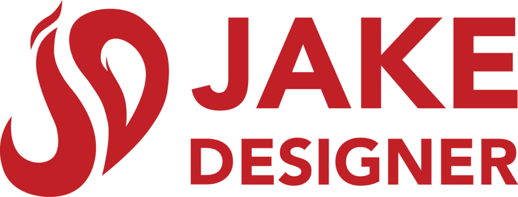
Final Logo
Final Thoughts
I know that at some point I’m going to want to change my logo again, but for now, I like how this logo turned out. I think It’s a better representation of me and what I will be creating in the future.
This is my Foundery Coffee Pub Rebrand. I created a rebranded logo, website, and merchandise mockups. I created the content using Photoshop, Illustrator, and Indesign.
Foundery Coffee Pub Rebrand Goal:
Take the given coffee shop and rebrand it so that affordances are strengthened and limitations are removed.
The coffee shop that I got was The Foundery Coffee Pub. At The Foundery, they have a very industrial-looking interior, which is something I wanted to enhance with a new logo. The Foundery also has a very Unique Selling Point, or “USP.” Rather than considering The Foundery’s coffee as the main affordance, the owner has considered The Foundery’s main affordnce to be the large space in their shop. Therefore, I also want to enhance the presence of their events page on their website.
Research
Located on Habersham St. in Savannah, Georgia, less than a mile away from the South Historic District.
Historic District is known for its cultural events and its farmers market, as well as being within close proximity of Savannah College of Art and Design.
Target persona: students of SCAD, and people ages 18 to 44 who are interested in socializing and enjoying cultural and artistic events.
After gathering the background information, I visited their website to see what affordances they offered. While reading through their “Our Story” page, I noticed that they market themselves as a place that is very centered around community and collaboration. They regularly host events that are meant to get customers to interact with each other, such as chess groups, and open mic nights. After reading through, I concluded that events are their main affordance.
“I don’t want to say coffee is not our number one product, but space is really our number one product… but we try to do coffee really well.” – Kevin Veitinger, Owner of The Foundery
What is UI/UX?
UI/Ux stands for “User Interface/User Experience.” The two work hand in hand. UI/UX is important because it ensures that the customer is able to journey through your brand without any confusion or strife. It also allows the customer to have the best brand experience. So what does UI/UX encompass?
User Interface refers to the look of the design. It’s the colors and layout that guide a User through their interaction with the product or service.
User Experience refers to how the customer reacts to the product or service. A customer’s experience can be described as positive, neutral, or negative. The goal of a design is to always garner positive experiences.
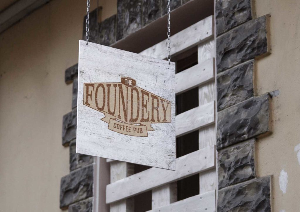
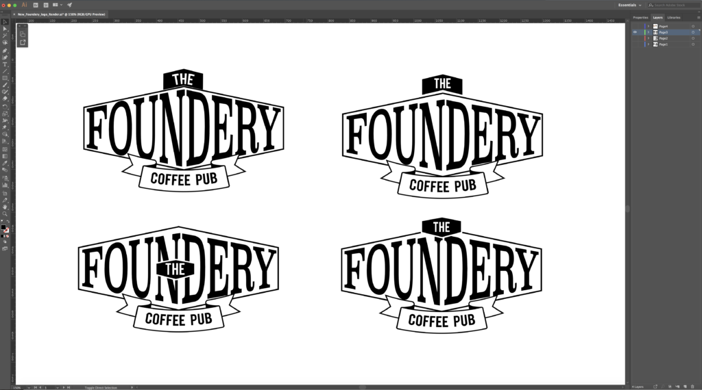
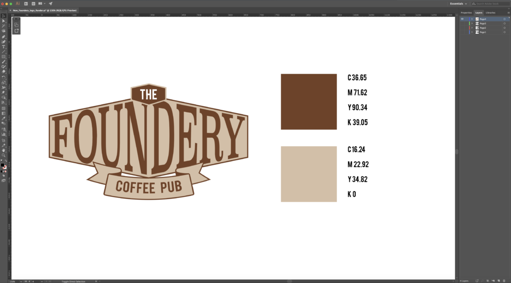
The New Foundery Coffee Pub Logo
The Foundery has a very… interesting logo. It’s basically a shield that is divided up into different sections. There is an “F” on the left section, and a coffee kettle on the right. There’s a weird stripe pattern on the bottom of the shield, and a line pattern on the top. Obviously, The Foundery’s logo is confusing and doesn’t convey the personality of the shop.
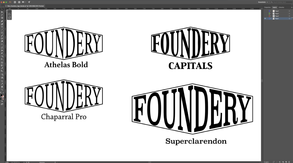
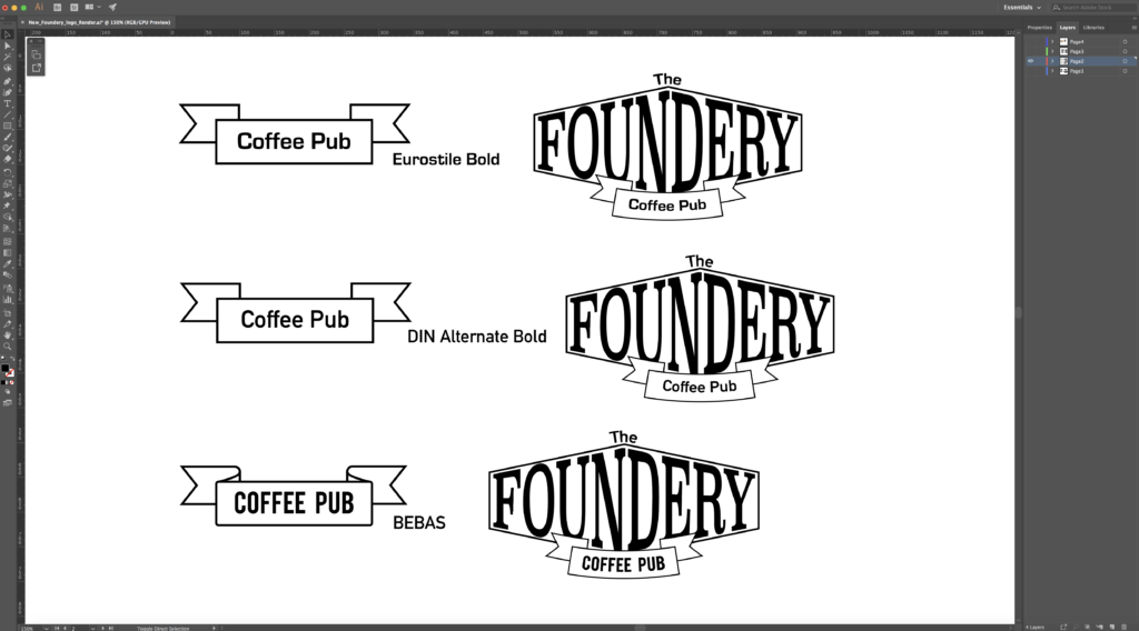
Since the inside of the shop produces a steampunk vibe, I wanted to design a logo that matched that atmosphere. I also wanted it to look old, but modern at the same time. For my final design, I incorporated a “flat design” badge shape with a ribbon at the bottom and a smaller version of the main shape at the top. For colors, I chose shades of coffee brown to remind people that despite the steampunk vibes, The Foundery is a coffee house at heart.
Font Choices: Superclarendon and DIN Alternate Bold
Superclarendon is a bold serif font. I chose it as the main font because it gives off a very strong industrial vibe that matches The Foundery’s atmosphere.
DIN Alternate is a slick sans serif font that pairs well with a thick serif font like Superclarendon. I used it in the top design and the ribbon.
Rebranded Foundery Mockups
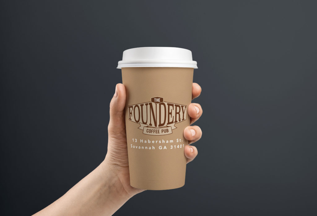
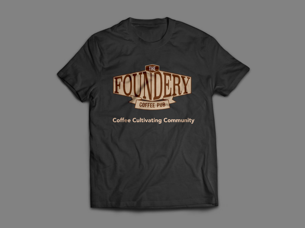
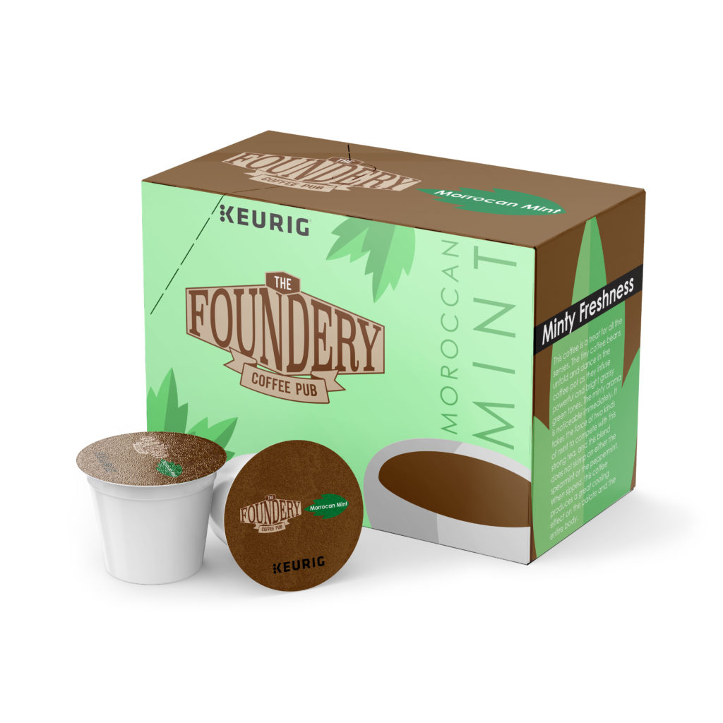
To enhance this rebrand, I incorporated the logo onto various mockups. This gives more life to the brand, and shows its effectiveness on different mediums.
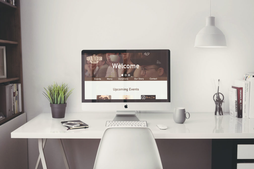
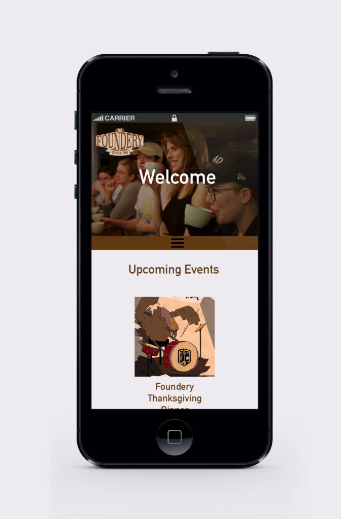
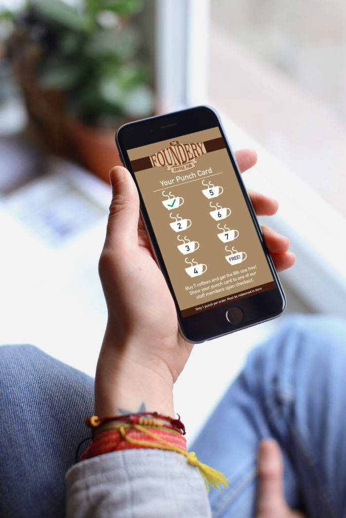
Rebranded Foundery Website
Finally, I created desktop and mobile mockups of my new Foundery website. I also included a concept for a mobile punch card. This reward system can improve customer experience and increase net sales.
Rebrand Results
I’m very pleased with how my rebrand turned out. I believe The Foundery’s sales will increase with this new identity, and the new identity will allow The Foundery to stand out from its competitors. I conducted a lot of research for this project and have gained a lot of knowledge about the rebranding process. I have also discovered, through this project, the importance of UI/UX and how it should dictate design. I have also discovered my passion for package design as well as logo creation.