Self Identity Rebrand
A Fresh Face
As graphic designers, we know that we can always improve on our work. Our self identities are always evolving with our style. When we learn new skills, we want to present them in ways that our audience will enjoy. Recently, having learned animation, I wanted to rebrand my self identity using the new skills that I have learned.
I have a separate case study on the animation of the logo. Check it out here.
Sketches
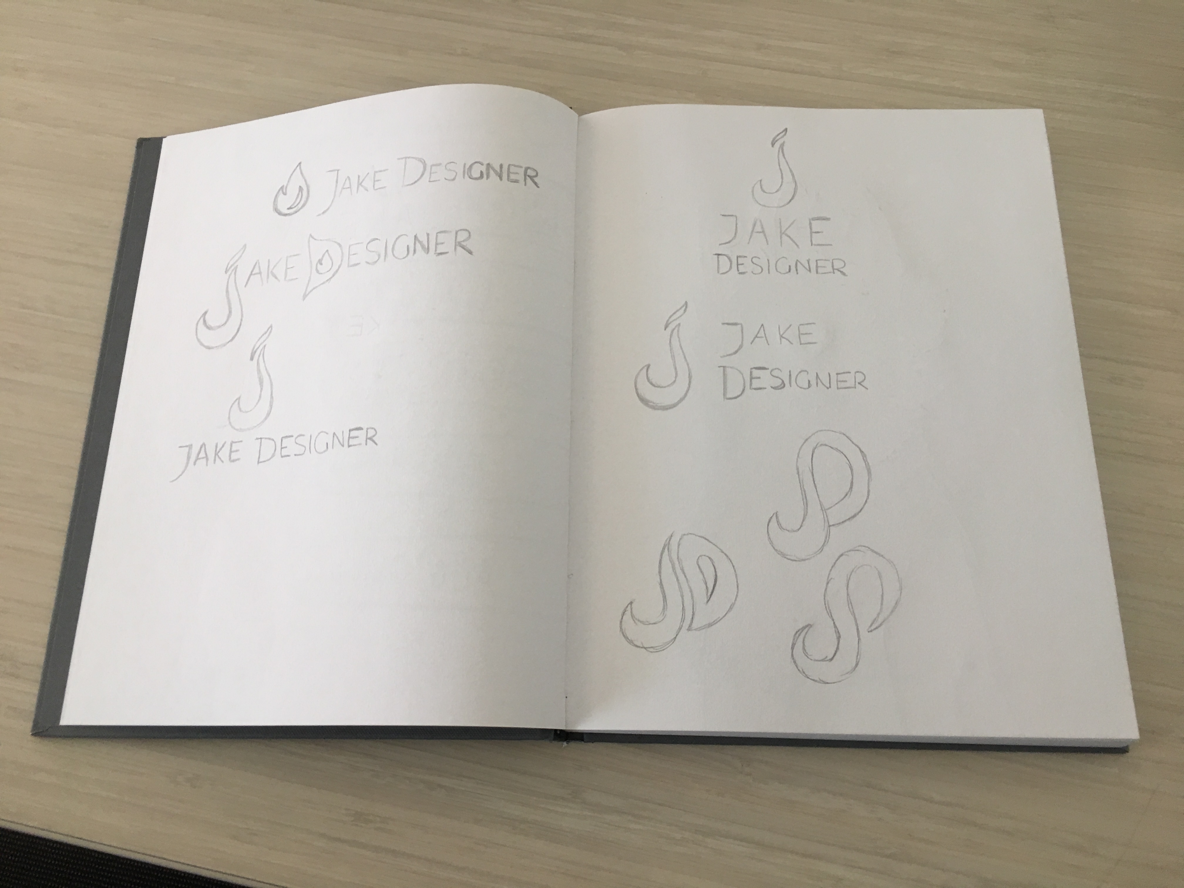
As always, I start by sketching a few ideas down. The main thing I wanted to include in this rebrand is the incorporation of a flame. Flames and fire have a huge significance for me. They remind me of when I used to be in Boy Scouts, sitting by the campfire and reminiscing on the adventures that my troop went on and what adventures we will go on next.
I still wanted to keep the letters J and D for “Jake Designer,” so I tried to create flame shapes out of the letters. It was challenging to make them look slick and modern, but I managed to settle on the shapes that you see in the finished design.
Illustrator Process
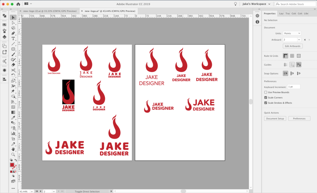
Time to start illustrating! I traced out the shapes of the letters with the pen tool and added a nice shade of red (#c02026) to the design. Choosing a font was a little challenging. I wanted a sans serif font that was versatile, but I was debating between thin or bold. I eventually settled on Avenir Next Bold. It’s a slick and clean font that works for almost all styles.
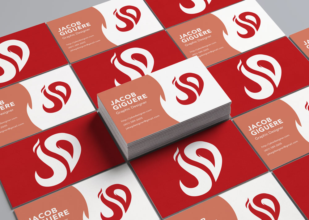
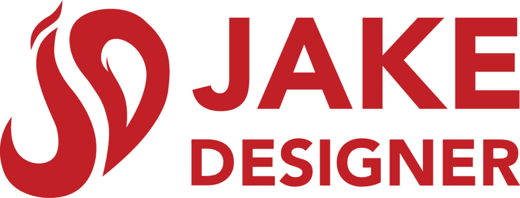
Final Logo
Final Thoughts
I know that at some point I’m going to want to change my logo again, but for now, I like how this logo turned out. I think It’s a better representation of me and what I will be creating in the future.
Need help creating your personal brand?
Let’s collaborate and make it happen!